Art Deco

This was supposed to be in a style of Art Deco for my illustration class. This is a watercolor painting of some of my characters. Art Deco is one of my favorite art movements. The character designs are outdated now, and I might show the updated ones.

Cubism

I’m not a big fan of cubism and I just make this because it’s school work, but I ended up liking this and I realized that green and orange look good together. It’s a watercolor painting. It’s a tea set up and the green background is suppose to be a blanket.

This painting was made three years ago. I wanted to post something, but I don’t think I have any original artwork. A lot of them are copied from references for school purposes, and some are just pieces that I’m not happy with. So I decided to post this old artwork that I made for school because it is original and I think it is good enough for me to post it here. The teacher thinks it’s good and so do my classmates. I think I meant to post this a long time ago, but I forgot. 

This piece is in complementary colors, which are blue and orange. The picture is based on my childhood. The things on the table are things that I loved as a kid and I still love them now.

Stress Relieving Art #2

This painting is one of my stress relieving art I did for an online class that is also a humor. Inspired by one of the videos of TheTekkitRealm on YouTube. His videos are great and I recommend watching them. This piece is actually a fan art and my teacher did not know.

The background is a beach so that it has an atmosphere that makes you feel relaxed and there is also humor because a laugh makes you feel good.

When the YouTuber rides the kid’s motorcycle that his subscribers bought him, it reminds me of the time when I ride my three year old cousin’s car, which was small enough for me to barely fit, because he allowed me to. Don’t worry, it did not break, I’m kind of light.

I hope this you find this funny and if not, at least relieves your stress.

Stress Relieving Art

This acrylic on canvas painting is inspired by Banksy’s Girl with Balloon. This was a project I made from last online school. It is a bit rush because when making this, I was bombarded with a lot if works since it was the finals and there are two more paintings I have to make during that time.

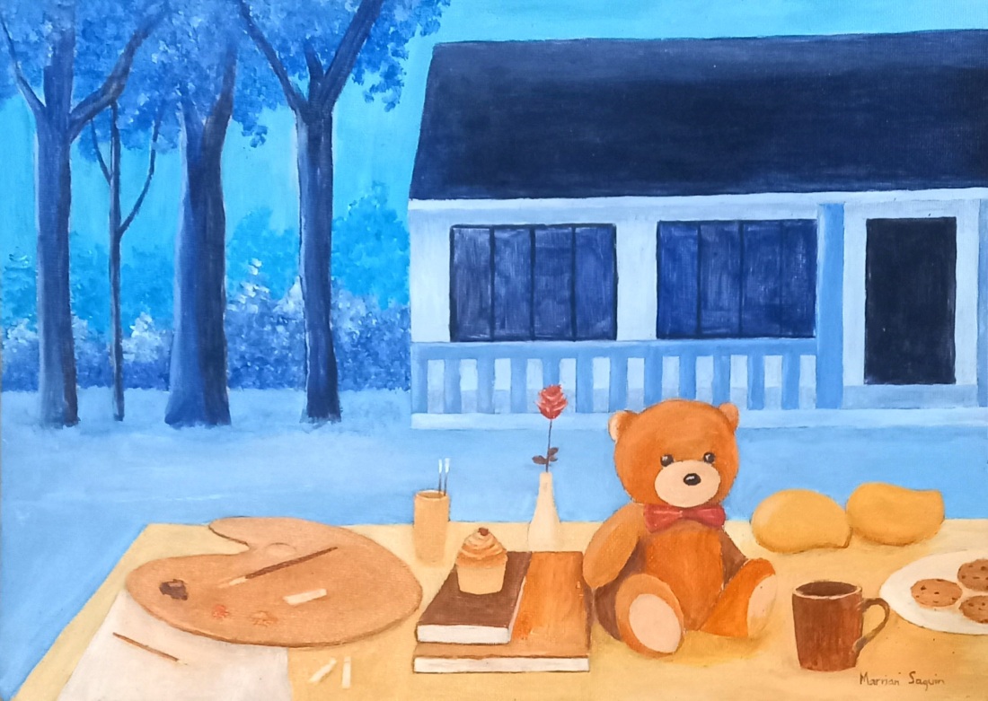
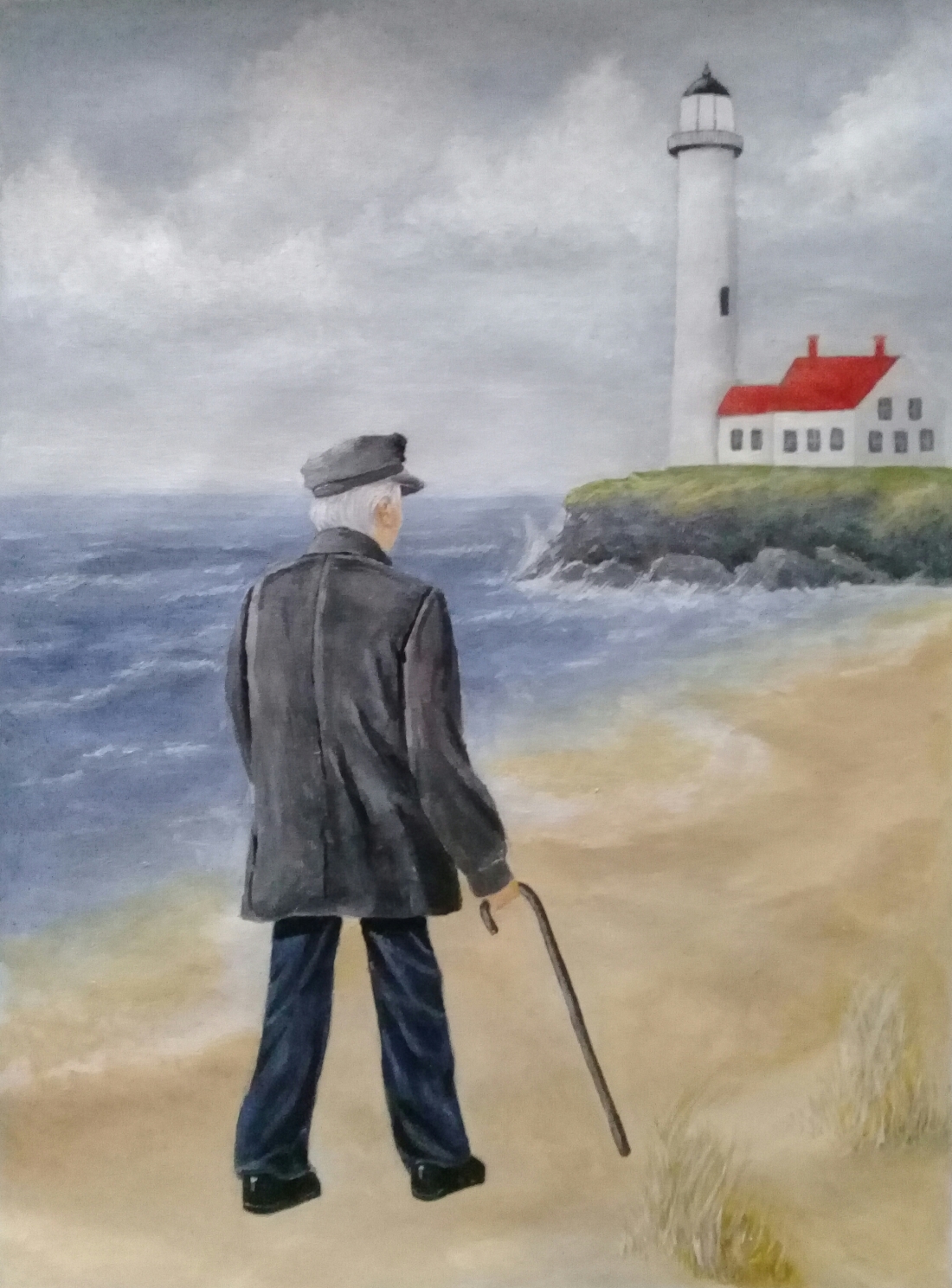
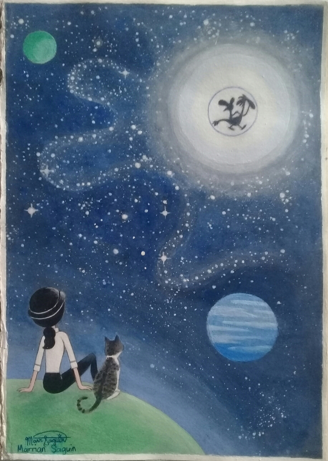
I made this piece as a stress relieving art. I don’t mean indulging in art yourself to reduce stress, but you can just watch an artwork and it can take away loads off your mind, leaving you nothing but relaxed. We were to choose an issue that serve as the context of our art and the issue I choose is depression. It causes feeling of sadness and loss of interest. Too much stress can lead to depression. How I may reduce this is through art by simply letting someone watch works of art. Watching and viewing artworks can reduce stress and anxiety, which can help overcome depression. We do not need to make art ourselves. We can just observe the art. So I decided to make some paintings that may relief stress and reduce anxiety.

I find some of Banksy’s art to be inspiring and funny. I want my artworks to have meanings and humor that can relief depression. Like Banksy’s Girl with Balloon that may symbolize loss, but the text next to it tells us that there is always hope even if there is loss.

A feeling of being relaxed and looking at a beautiful view like a starry night sky or a sunset. The girl with balloons, which was inspired by Banksy’s Girl with Balloon, was meaning to say that you can do what you love that is good for yourself, know that you are a great person and that if you ever feel tired, you deserve a break so that you can feel good and reduces stress.

I did mention that there two more paintings. As for them, I will post one of them later and I don’t want to post the other one because it a last minute idea that I ended up not liking. So one of those paintings will be posted later on and I might post some more urban sketches I did for school. The three paintings may have reminded me of how tired and even stressed I was that I just want to sleep, but it was over and I hope will just laugh at it later on. Overall, I love two of them. I hope that the image above relieves your stress.

Lighthouse Keeper

This is an original artwork so it won’t get as many likes as my fan arts especially in instagram.

I can see why people love to see fan arts. I hope I can make more in the near future.

This is a project from my last school year. Proportion is the principle of design that is found in this acrylic painting. Proportion is the relationship between the size of elements in an image. This is a painting of a lighthouse keeper on his way back to the lighthouse after a talk on the beach. The proportion emphasizes the distance of the lighthouse. Proportion not only indicates the size differences of the elemants, it also indicates distance and location. A lighthouse should be bigger than a person, but in this picture, the man looks bigger than the lighthouse because he is closer to the viewer while the lighthouse is further away.

Bottle Painting

I haven’t posted in a while. I was suppose to be free these days because I our online schooling is over but something is making me do something else. The bottle artwork over here is a project in school. When I have done painting on his bottle, my parents saw it and think it’s cool so they want me to make another one or more in other settings, which sucks because when you’re an artist, you know the feeling when someone ask you to do draw something for free or you’re not passionate about, but they are my parents and there is nothing I can do about about it. Speaking of an artist problem, being an artist is both a blessing and a curse.

Now, I will talk about this artwork. The painting has a principle of design, which is emphasis. How I made the fox as the focal point is through contrast, which is when an object is different from the others, stands out the most and easy to spot. The fox is the only one with bright orange color that catches more attention and dominated the winter background. I made this artwork by painting the area of the bottle with white acrylic paint and then I painted misty background, the trees and the fox.

The wine bottle is from my grandfather. I don’t drink alcohol.

The Kitten at Home (New)

Here is a new version of “The Kitten at Home”. It is more detailed than the first one. The meduim for this is acrylic on canvas. I painted this for my first art exhition at school where painting majors gets to showcase their art. I have been having feelings of nostalgia. Ever since I moved for college, I really miss home so I repainted “The Kitten at Home. This painting is based from where I live. We have a garden, there are a lot of maya birds and chestnut munia in there and I have pet cats. I don’t have the first painting anymore because I passed it to my teacher and she never give it back, but I get to keep this new one.

The Man in his Own World

I haven’t posted in a long time. I have been busy the past months. I’m far away from home because I have moved for college and I’m taking a fine arts course.

This acrylic on canvas painting is a project in school with the theme: “What detachment from the world can tell us.” We all have different uderstandings of the theme and here is mine:

It is a picture of man standing in a small planet and he is away from earth. The man is someone who has his own world. He made his world because he was so different from other that he is having a hard time fitting in with the real world and there are so much chaos. His own world was a much better place because it was a more peaceful and lighthearted wonderland. The planet was rather small, but it was beautiful. It was a place for him to be happy and to comfort and soothe himself.

This painting comes with a haiku poem. I don’t know if it is good, but my clasmate think it’s nice. Here it is:

Here in my planet
Like Alice in Wonderland
Springtime is all day

Wander Over Yonder Fan Art

This is my Wander Over Yonder fan art. It is in my sketchbook and painted with acrylic paint. I’m posting this and I going to further tell the story behind this fan art.

WOY is an animated series created by Craig McCracken. It’s about two intergalactic travellers, who help people to have fun and live free. I really love the show and it became my favorite because it was charming and funny. It’s like a show that I always wanted to watch and the main protagonist, Wander, is really funny, a character that I like to be the protagonist, and the deuteragonist, Sylvia, was a tough female character and that is something I like. As an artist, I love the animation because it’s colorful and a beautiful work of art. When I watched more episodes, something changed my life forever. The show was more about helping others and doing good and it inspires me to do so. It shows the true meaning of helping. When I help someone, it feels good. I become a better person. If you help others and do good, I know you will be rewarded like the people will help you back.

This is my favorite WOY fan art that I have ever made. This is a picture of a girl that looks like me, but it could be anyone, with her cat witnessing Wander and Sylvia. I may want to allow the fans to make their own version of this like changing the appearance of the girl to make her look like them and also change the cat to whatever their pet was. I share this on twitter, but I don’t know if someone make their own version. But I don’t want anyone turning my idea into theirs. I came up with this picture after the show was cancelled. I was sad and angry that it was cancelled because the show had become a part of my life. Think of the good things the show have done to me and how it helped a lot people. I made this fan art to express how I love it and how much I miss it. I write a short poem for this.

Is it the sun, the moon or a star?
I witness something that came across it
I know no one will believe me expect my cat
But what I’m seeing is just wonderful