This is an original artwork so it won’t get as many likes as my fan arts especially in instagram.
I can see why people love to see fan arts. I hope I can make more in the near future.
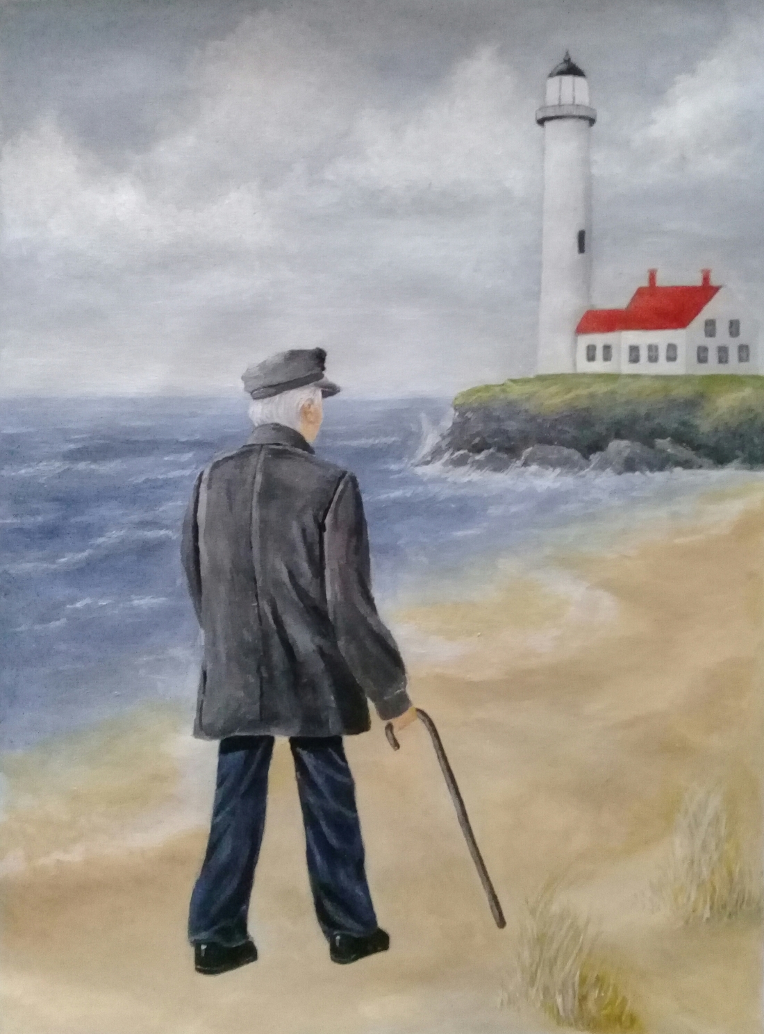
This is a project from my last school year. Proportion is the principle of design that is found in this acrylic painting. Proportion is the relationship between the size of elements in an image. This is a painting of a lighthouse keeper on his way back to the lighthouse after a talk on the beach. The proportion emphasizes the distance of the lighthouse. Proportion not only indicates the size differences of the elemants, it also indicates distance and location. A lighthouse should be bigger than a person, but in this picture, the man looks bigger than the lighthouse because he is closer to the viewer while the lighthouse is further away.